My Contribution
This project was an internal exploration, driven from executive stakeholders after many discussions with current and potential customers during the sales process. I was the sole designer, leveraging my existing knowledge of the admin system while balancing feedback from VP's to help define the feature set while also incorporating the latest styles from the design system of a related product.
Project Background
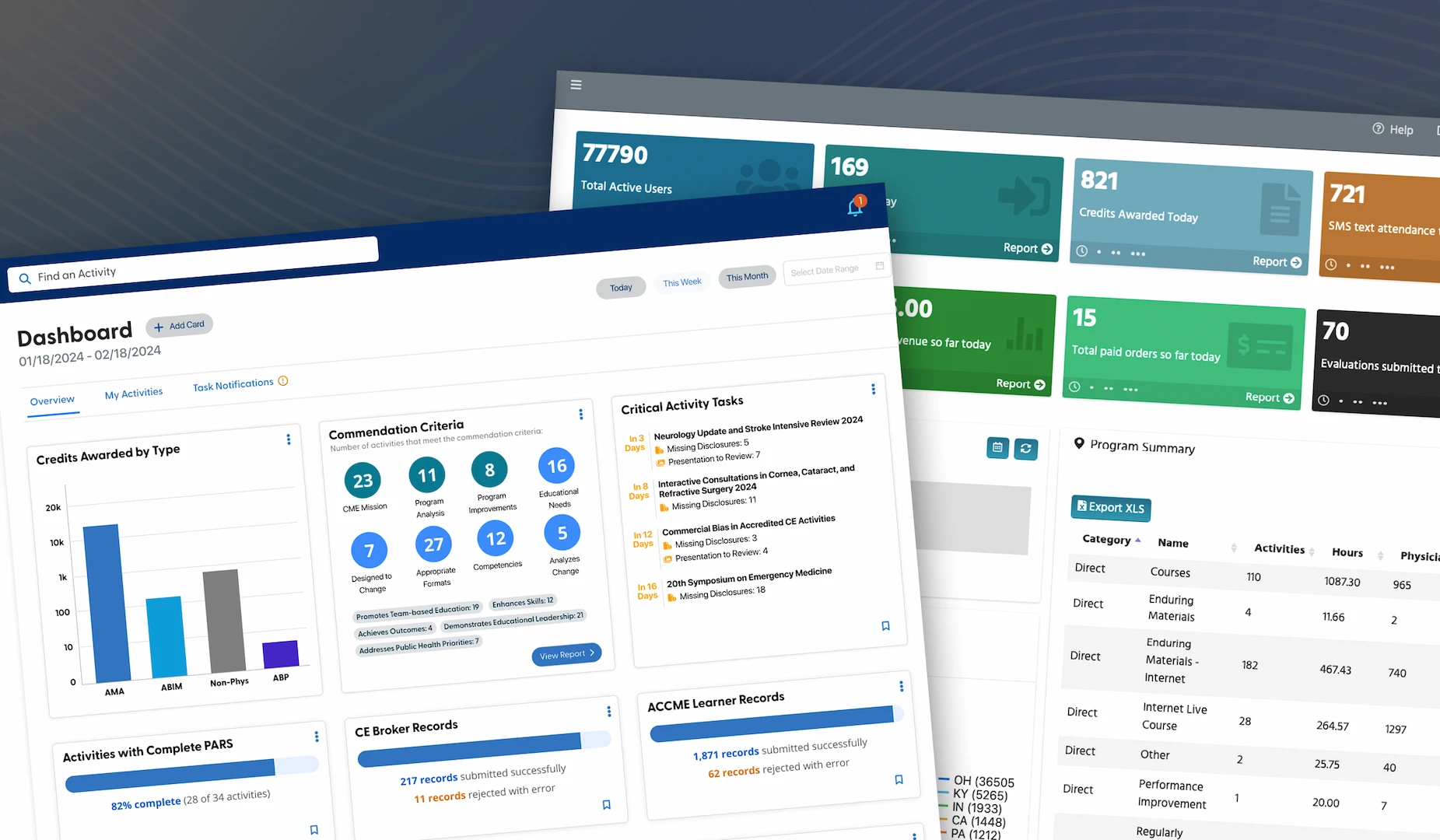
This healthcare enterprise SaaS deals with a wide range of complex areas, such as financial status reports, user attendance and credits, activity evaluation data and regulatory compliance reporting. Admin users have a huge amount of potential data to review and the dashboard is the first place they land when they login.
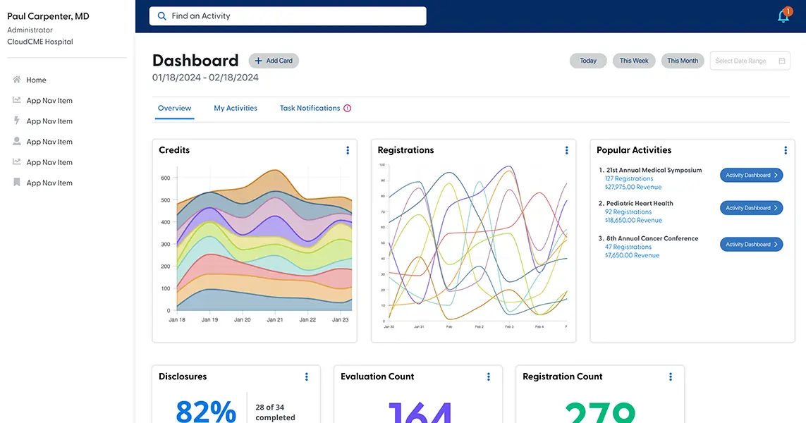
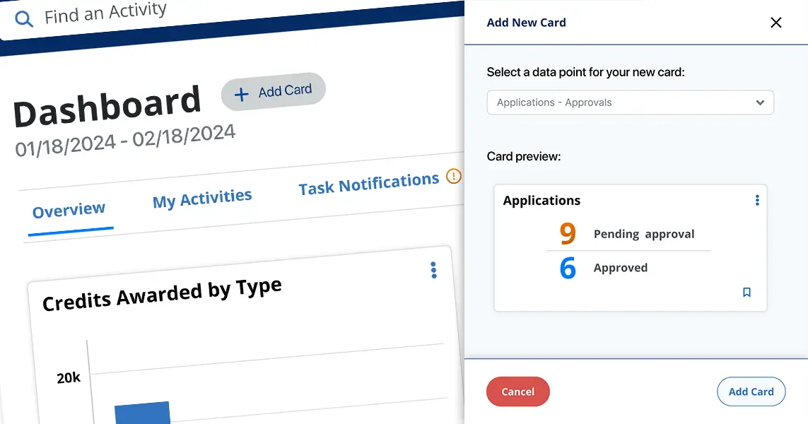
The existing dashboard is a fixed entity with a limited number of datapoints to review. Users need control over which datapoints to show, the priority order, and depending on the persona of the admin, there could be a wide variety of different priority views to accommodate. For example, a finance admin may want to see revenue and registration counts, where an activity coordinator would get the most benefit from viewing attendance and user evaluation information.
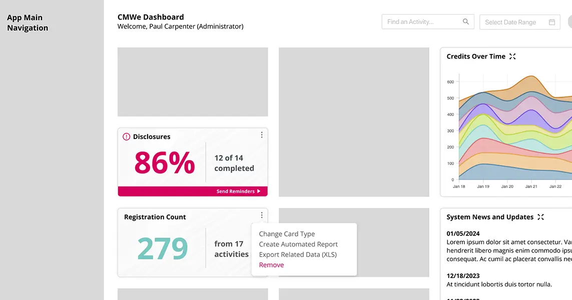
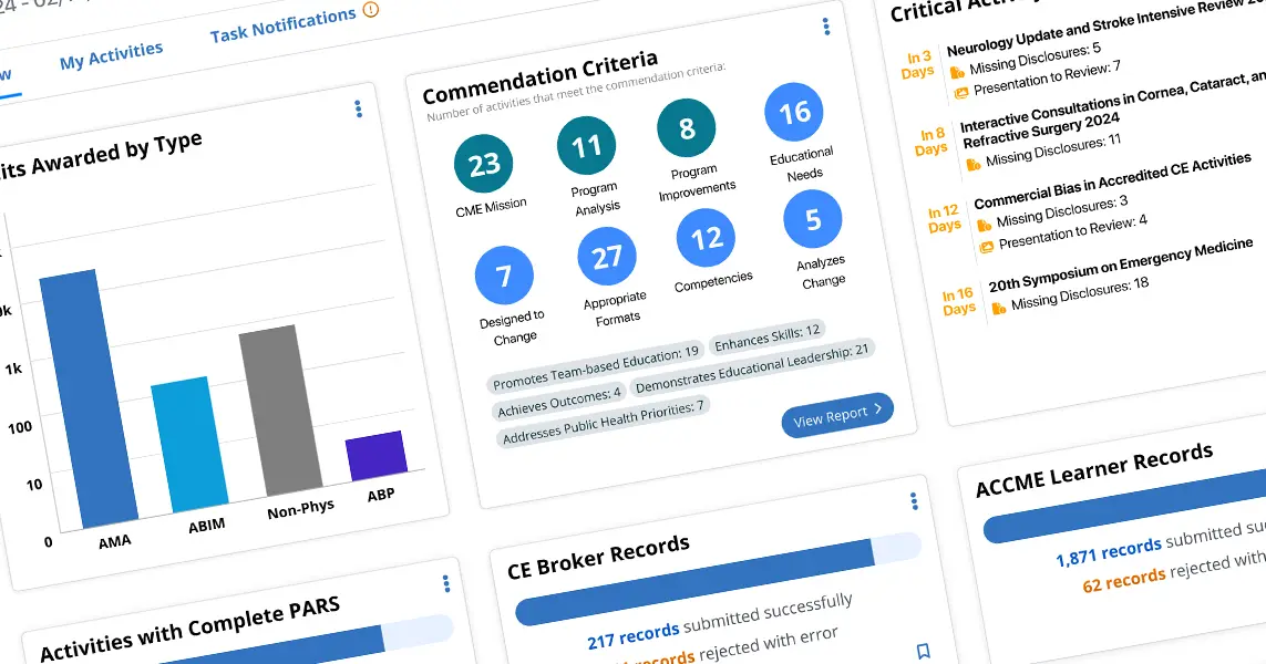
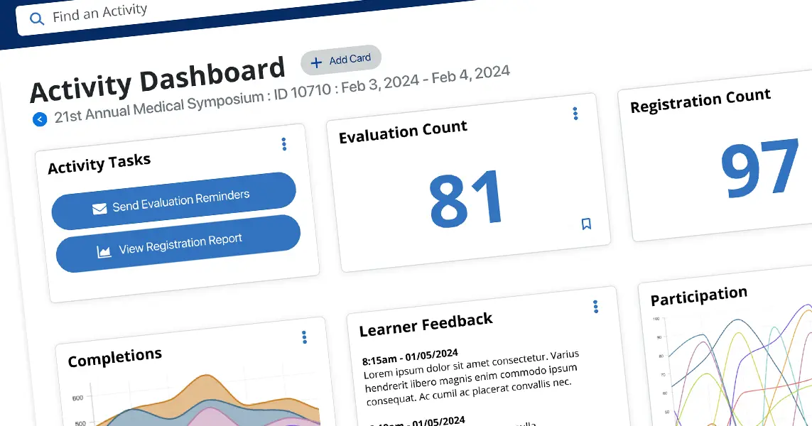
We wanted to provide a new approach that offered a greatly expanded number of data options and allow admins to choose exactly which data cards are most useful to them. This set of cards could be arranged in any order and provide real-time overviews for any timeframe. Many of the cards would provide actionable next-steps or useful notification states so that admins can keep up-to-date on their CME program and work on current issues without the need for visiting dedicated reports or other pages in the system.
Finally, this project would help set a direction for future development of a best-in-class product and give executive stakeholders a vision for what approaches can be taken to build cohesiveness at a platform level.
The Problem
Analysis & Design
We began the design process by looking at two primary factors:
By examining our current dashboard and other admin screens, particularly our extensive list of "canned" reports, we were able to build a list of roughly 50 main items that would provide value by being elevated to the dashboard. Currently, admins would have to enter the system and navigate to a dedicated page, select from filters or choose date ranges and run a report to get the high-level number. The dashboard card could provide a similar result and be immediately available for review.
Our largest competitor in the CME space provided user-configurable dashboards but through careful review of public material and some inside information from our customers, we learned that they relied very heavily on a third-party datagrid. While these Excel-style displays were flexible in what data they could deliver, the overall UX was poor, setup was confusing, and there was very little effort made to create a pleasing UI or give the data glanceability.
With that strategic information in place, I leveraged the design system from another internal project as a starting point for this design exploration. I had assisted with refinement of that design system through weekly meetings with the VP of Product and his design team, so I was familiar with its components and capabilities.
The Solution
The final Figma prototype communicated the overall direction of this new dashboard and highlighted the primary design thinking:
The Challenges
One of the difficult aspects of this project was that the variety of data that needed to be displayed was very wide and often quite different, so minimizing the number of styles and layouts within the cards proved tricky. Some cards are necessarily more complex and require more elements and at the phase shown in this case study I feel there is still refinement necessary to bring the overall number of visual treatments down.
Another challenge was that the design system, while robust, was built for a different product so there were gaps in the components that needed to be filled. Not all card/data types had any analogous component to use which resulted in extension that did not have the opportunity to pass through a full design review. In this case, as the project was an internal exploration, this was not hugely critical but if this dashboard concept passes to later development phases then we would need to do a more thorough design review and establish proper patterns for the use-cases that this dashboard requires.
Conclusion
As an internal design exploration this project was successful, showing that we can leverage existing data but provide a significantly more flexible approach that gives our users more effective information to run their day-to-day operations. Stakeholders will be using this prototype to communicate the overall future direction of the UI of a new product and to build enthusiasm for the more cohesive, platform-level direction of the company.